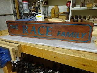
I'm a horrible gifter, rarely knowing what to get for people. Heck, I never want anything for myself! How would I know what other people might want? But I got a little inspiration this year. My wife's daughter had a baby in May and we became grandparents for the first time. Now that they have a little family, I thought maybe their house needed a sign.
So off to the internet I went, first looking at images of signs people have on their houses, then looking at videos of letter carving. I had a nice chunk of redwood lying around that would be easy to carve. And there was enough to cut off a bit to practice on first.
 |
| Some practice letters and a border |
 |
| The quarter-circle at the corner of the border was a challenge |
 |
| But practice makes better |
I was pleased with how the letters came out, but thought they were a bit too tall at 4" on a 6" tall board. So I did some drawing in Sketchup to get a feel for proportions and decided on about 3 1/8" tall for the larger letters and 1 5/8" tall for the smaller letters. The practice border was too narrow to make with a 1/8" chisel, especially those curved areas in the corners. So I chose them to be just shy of 3/16" wide and 1/8" deep. The corners were drawn with the help of 1" and 1 1/4" diameter circle templates. The circles were centered at a point 1/2" from the end and 1/2" from the edge.
The practice letters had been printed from a Word document and then cut out of the paper with a sharp knife. For the final version, I got my wife to help me by printing on her Cricut, which she uses when scrapbooking. The Cricut is basically a CNC paper cutter. It's really cool and does a great job making letters (or shapes of any kind). She can use any font that is loaded on her computer.
 |
| The templates taped to the workpiece were used to draw the letters |
 |
| Most of the carving done |
I'm not an experienced carver. I'm sure it takes me at least 4-5 times as long to do the lettering as it does for someone who does it a lot. But I've got the time and patience - and it takes a lot of patience.
 |
| Some "stop cuts" aid in the removal of material |
A couple really useful tips I got from Bill Schenher's (Billy's Little Bench YouTube channel) video on letter carving was first to draw (and chisel) center lines in the letters and second, make stop cuts where transitions occur.
 |
| The stop cuts end up making the little triangles at the ends of the straight sections |
The letter carving came out great. I did it with the workpiece in a vice, so it was about 36" high. My back ached at the end of the days I carved. I can handle that with the amount of carving I do.
I thought I'd paint the letters for extra visibility. The practice piece was used to evaluate colors. My wife had the brilliant idea of using purple and teal, the giftees' favorite colors. I first painted the border purple and the letters teal, but that looked horrible. Then I tried some white in the border and that still didn't look good. In the end, both letters and border were painted teal.
 |
| The practice piece with some test painting. |
The nice thing about painting is that if there is some spill-over onto the wood plank, I could just plane it off, and that's what I did. A few plane strokes really made the letters crisp.
I also tested some finish techniques on the practice piece. In the picture above, the "R" and surrounding wood have a couple coats of shellac. The "A" and "HEA" are raw wood. There was no seepage or creep of the paint on either section, so I didn't think it would be necessary to use shellac as a sealer. In the end, I coated everything (paint and wood) with BLO for a little protection.
And here's the finished sign. I hope they like it!
 |
| Glamour shot #1 |
 |
| And with raking light |
No comments:
Post a Comment